Branding Energio.
“I did engage someone a year back to redesign my website, but it is not exactly what I am looking for. After a few rounds of discussion, the project was abandoned, so it was quite an unpleasant experience.”
When Yi Shien booked a call with us, she wanted us to help her solar business with its brand identity and website.
She also said something that stuck with us: “I like that your works are modern tech looking, simple and clean. I’m hoping to see if we can align and collaborate.”
Not gonna lie, that boosted my ego a little. But that was the signal. Clear taste, clear intent, and a real opportunity to do things right this time.
I knew we had to do SOMETHING to bring her vision to life. So how did it turn out? We were just as curious then as you are now.
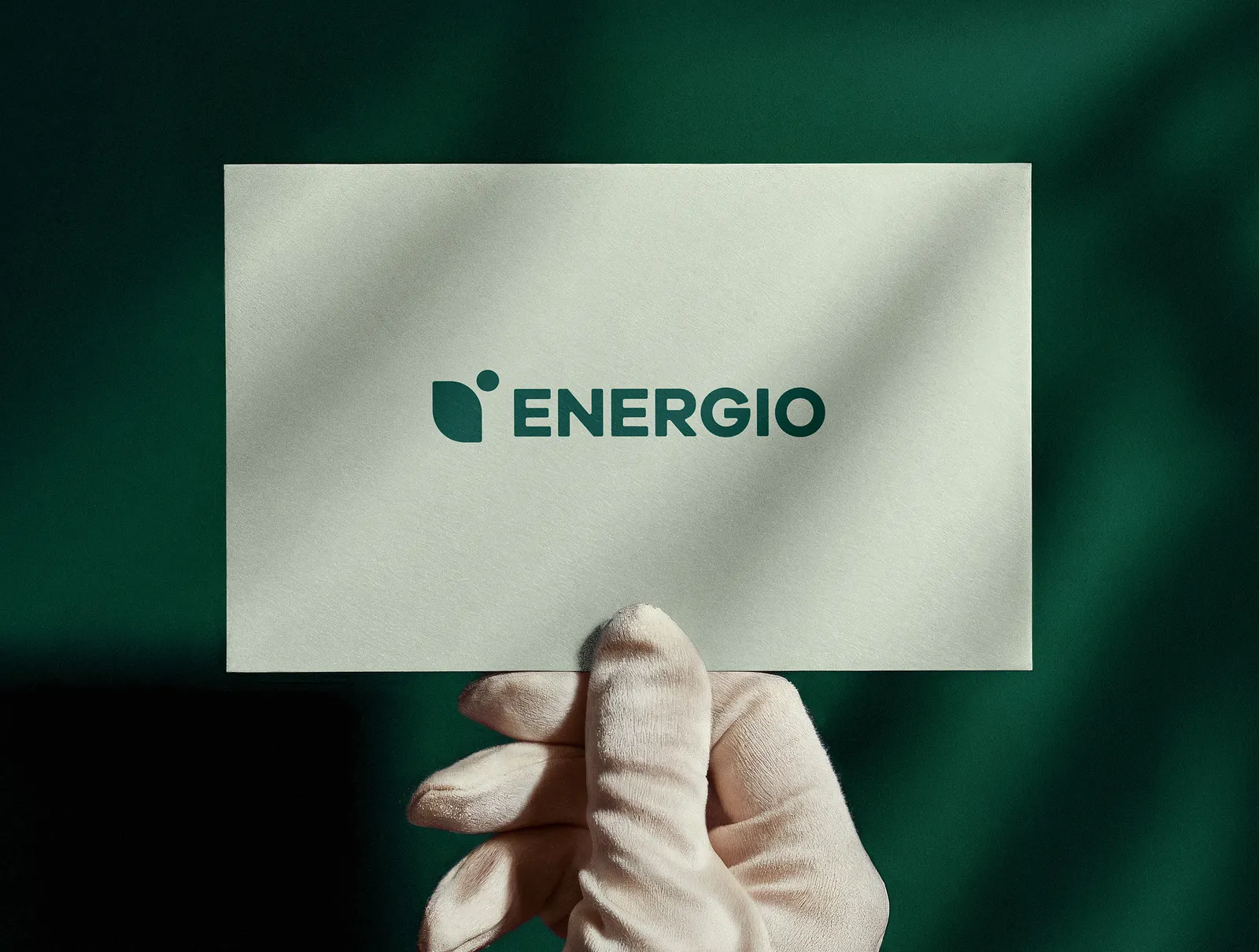
Precision. It all starts with the name.
“What’s the brand called?” “Energio,” she said. My brain went into overdrive. Energio…
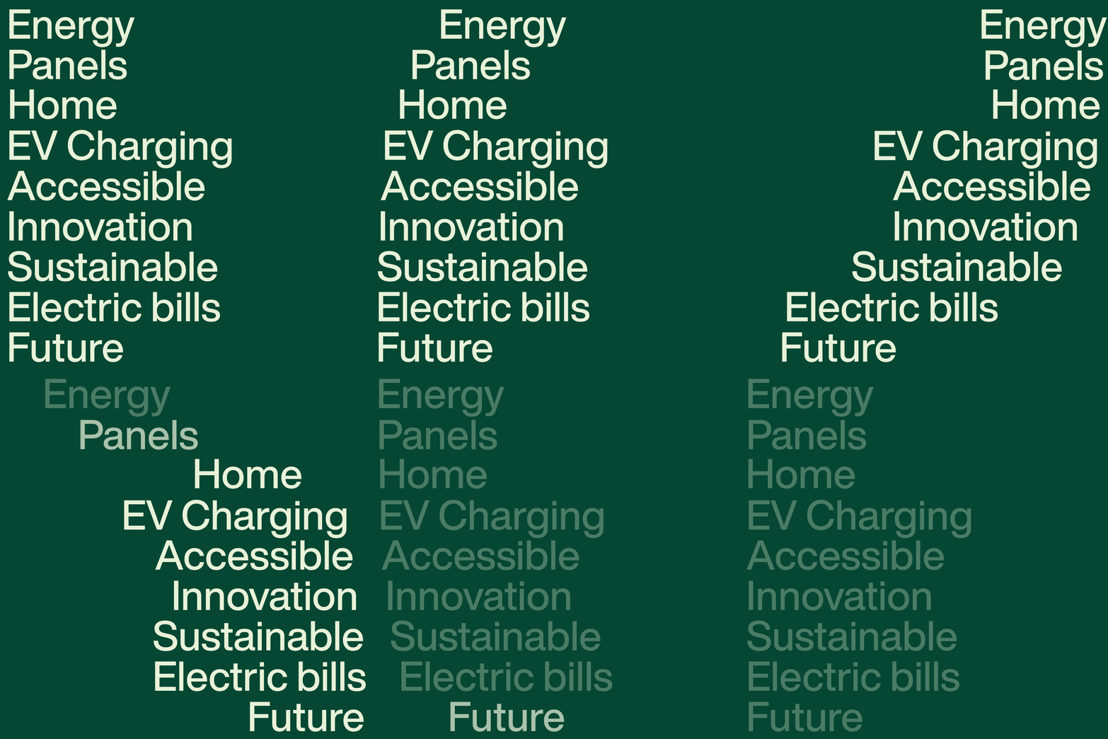
Energy? Solar panels? Home? EV charging? Accessible? Innovation? Sustainable? Electric bills? Carbon footprint? Heck, the FUTURE?
Energio is a leading provider of Solar PV integration and EV charging solutions in Singapore. They aim to make clean, renewable energy accessible to everyone and empower a sustainable future.
They’re dedicated to helping homeowners and corporates reduce their carbon footprint and save on electricity bills.
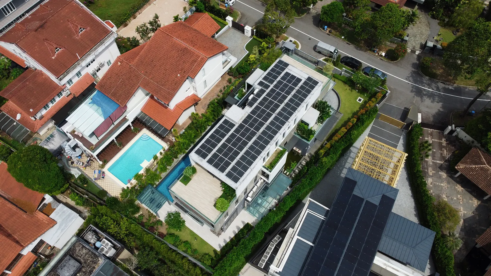
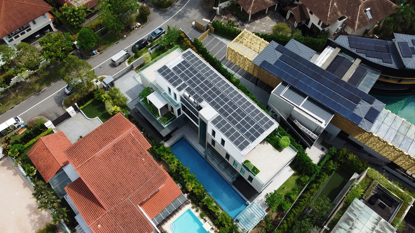
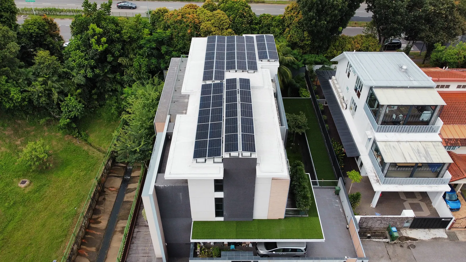
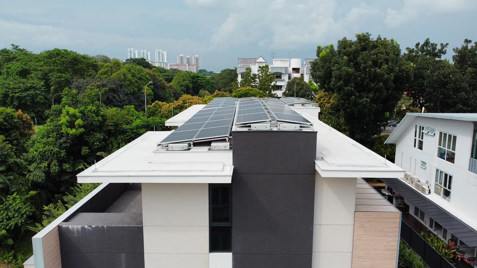
Born from a personal mission
When my father was building our family home, he couldn’t find a solar partner who could provide a satisfactory answer or guidance that he needed. Hence, he decided to build the system himself with the help of the contractor we trust.
Through this, we are able to stand from both the standpoint of a homeowner and a service provider, which is a very valuable USP of Energio.
We learnt firsthand what homeowners really go through; the doubts, questions and pain points that come with going solar.
But before the work, there’s an issue with this industry…
Solar is supposed to be the future. Yet for most homeowners, it’s confusing, overwhelming, and filled with jargon no one bothers to explain (like who knows what’s solar to begin with honestlyyy?)
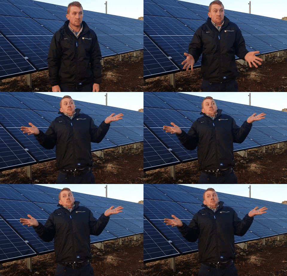
Here’s the thing about solar that most companies don’t want to admit: you can’t sell solar the way you sell a product. Nobody wakes up, sees an ad, and impulsively installs a solar system on their roof. It doesn’t work like that.
Solar is a considered purchase. Meaning it requires education, trust, and time before a customer ever picks up the phone.
How does a solar PV system actually work? What’s the ROI, and how long does it take to break even? What happens on cloudy days? What about the grid? Is my roof suitable? What’s the installation process like? What grants or incentives are available in Singapore? Who do I trust to give me an honest answer? and moreee…
That’s a lot of questions. And in an industry full of salespeople who’d rather skip straight to the quote, most homeowners never get satisfying answers. So they do nothing. They sit on the decision for months (sometimes YEARS!!!) because the information gap is too wide and the stakes feel too high to guess. Everyone talks about savings, panels, and efficiency, but rarely about what it actually means for you. How it works. What the process looks like. All the small but critical details that make or break the decision.
The uncertainty. The unanswered questions. The fear of making the wrong call. That’s the gap Energio exists to close. And it’s also why brand strategy mattered so much here.
So, what the f**k is solar?

We’ll let Yi Shien and the Energio team handle this one if you’re interested. We’ll do what we do best (design).
First, we talk strategy.
For every project we take on, we start by getting clear on one thing: what is this brand really about, and how does it want to show up?
To get there, we go through a few key steps:
- Define the vision and mission
- Figure out the positioning
- Sharpen the value proposition
Sounds like an answer ChatGPT would give. But these steps will never go wrong. These come together to form the brand idea — the core feeling at the heart of the brand. Some say it’s what gives the brand its personality, and yes they’re right.
After all the brainstorming sesh and understanding all the core points of the business, an idea clicked. “Make Solar Accessible.”
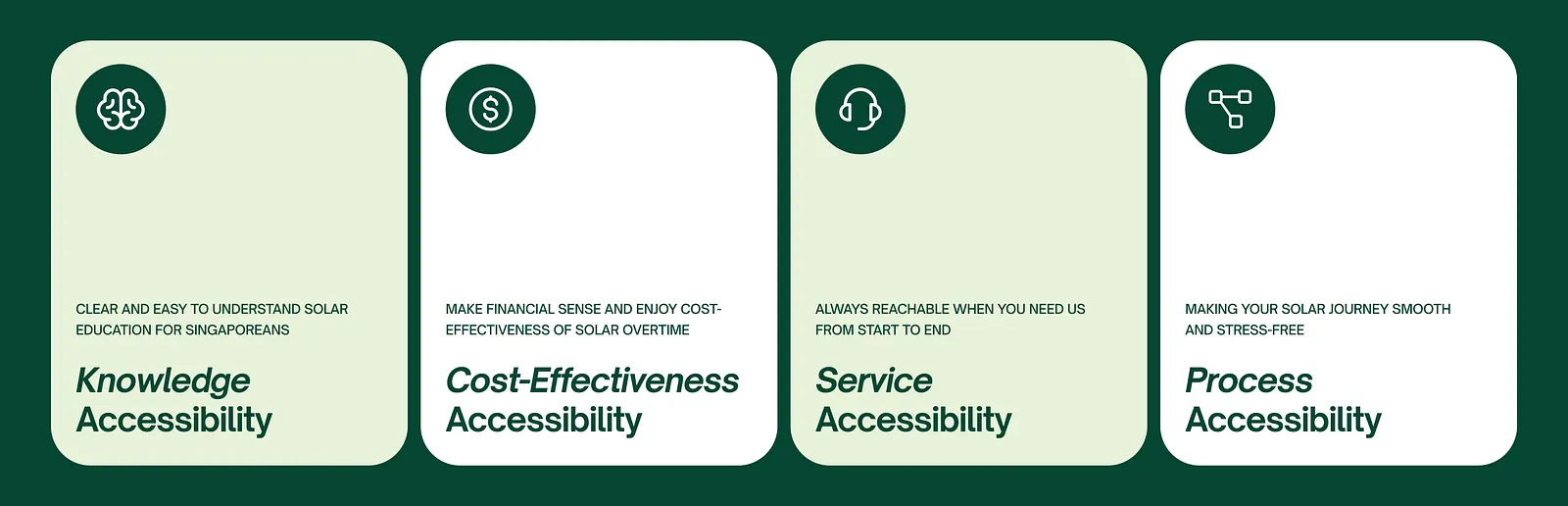
We wrote it down immediately. This is it. We want to make solar accessible. Not just in one way but across four dimensions:
Knowledge Accessibility: demystifying solar so homeowners can actually understand what they’re buying and make informed decisions with confidence, not just hope
Cost-Effectiveness Accessibility: making solar financially attainable, not just aspirational
Service Accessibility: responsive, human support throughout the entire journey
Process Accessibility: a clear, guided path from inquiry to installation
Knowledge comes first. Intentionally. Because in an industry where the purchase decision lives or dies on trust and understanding, education isn’t a nice-to-have. It’s actually the product itself. If a homeowner doesn’t understand solar, they won’t buy solar. It’s that simple.
These four pillars became the strategic backbone of Energio’s entire brand. Every design decision, every piece of copy, every touchpoint. It all ladders up to this.
Energio is for Singapore homeowners who want to invest in solar but feel lost in the complexity and unreliable information. It is the solar partner that makes everything accessible, with guidance, transparent expertise, and support that evolves with customers throughout their entire solar journey.
Energio runs on principles
Principles are what set how they breathe, think, and act.
Principle One: Bold
We take a confident stand in simplifying solar, leading clients toward clarity and empowerment in a jargon-heavy industry. Our boldness reflects in our visuals, tone, and actions — we stand out as a brand that makes solar adoption feel effortless and empowering.
Principle Two: Expert
With deep knowledge and real homeowner experience, we turn complexity into confidence. We educate without overwhelming, helping clients make informed decisions they can trust. We find interesting ways to make solar topics digestible, memorable, and enjoyable.
Principle Three: Sincere
Sincerity drives everything we do. We listen, empathise, and communicate transparently, building relationships grounded in care, honesty, and lasting support.
These three principles gave Yi Shien and her team something concrete to rally around. It’s what we call a “culture document” and not just any design brief.
Logo
The iconic leaf that speaks for the brand.
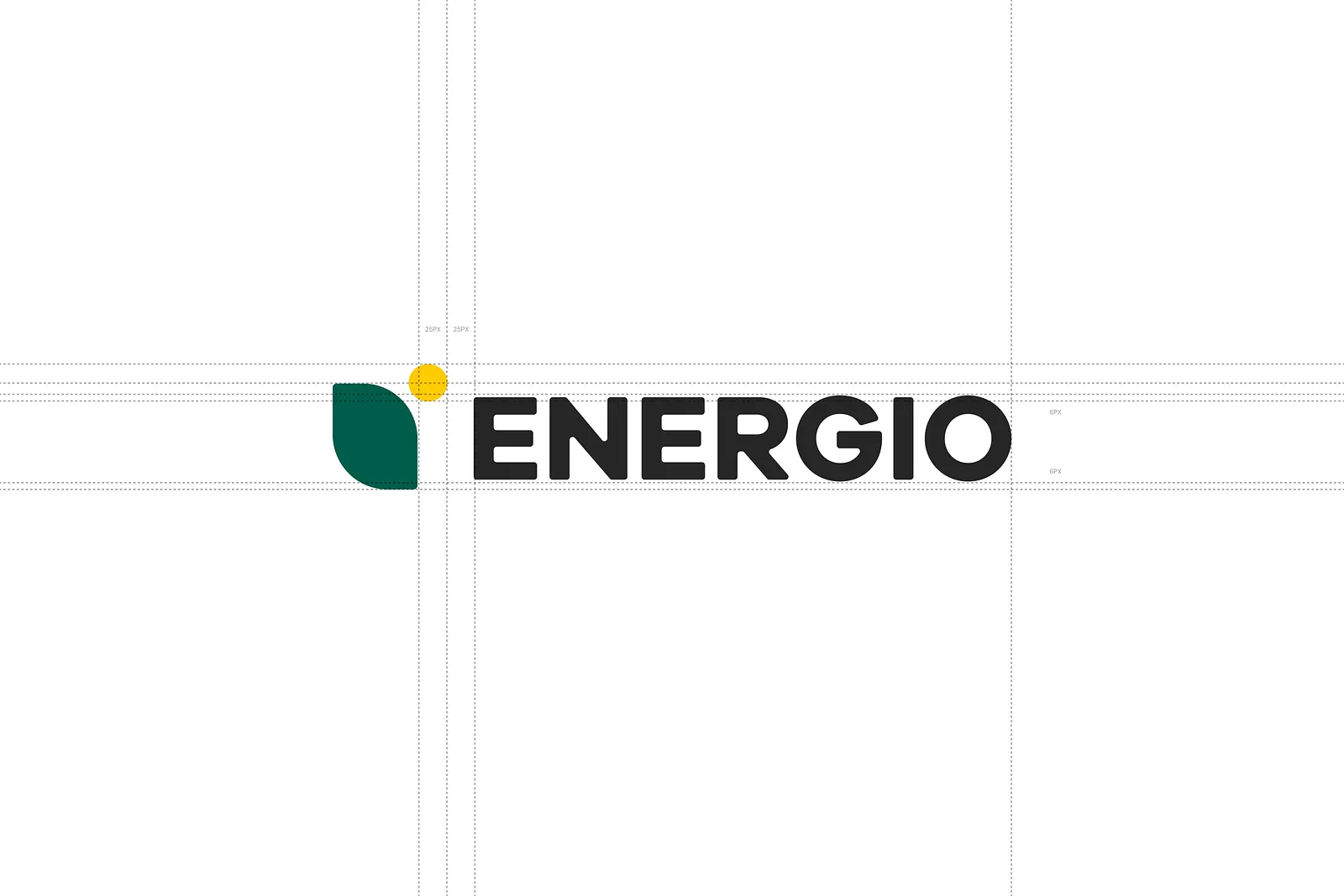
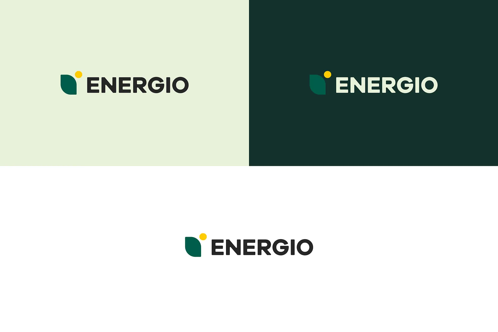
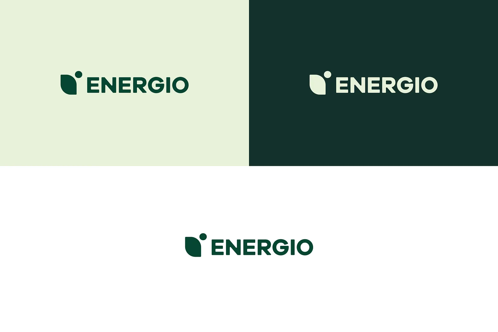
The iconic leaf that speaks for the brand
Energio came in with an existing logo. A leaf and sun motif that we actually thought had strong bones. The symbolism was right: sustainability meets solar energy, combined into a single, modern mark.
So we kept it. But we made it work harder.
It carries the entire promise of the brand (clean energy, natural harmony, a sustainable future within reach). Paired with a bold, geometric wordmark, the logo strikes a balance between approachability and strength. It reflects Energio’s dual perspective: they’re not just a service provider. They’re a homeowner who’s been through exactly what you’re about to go through.
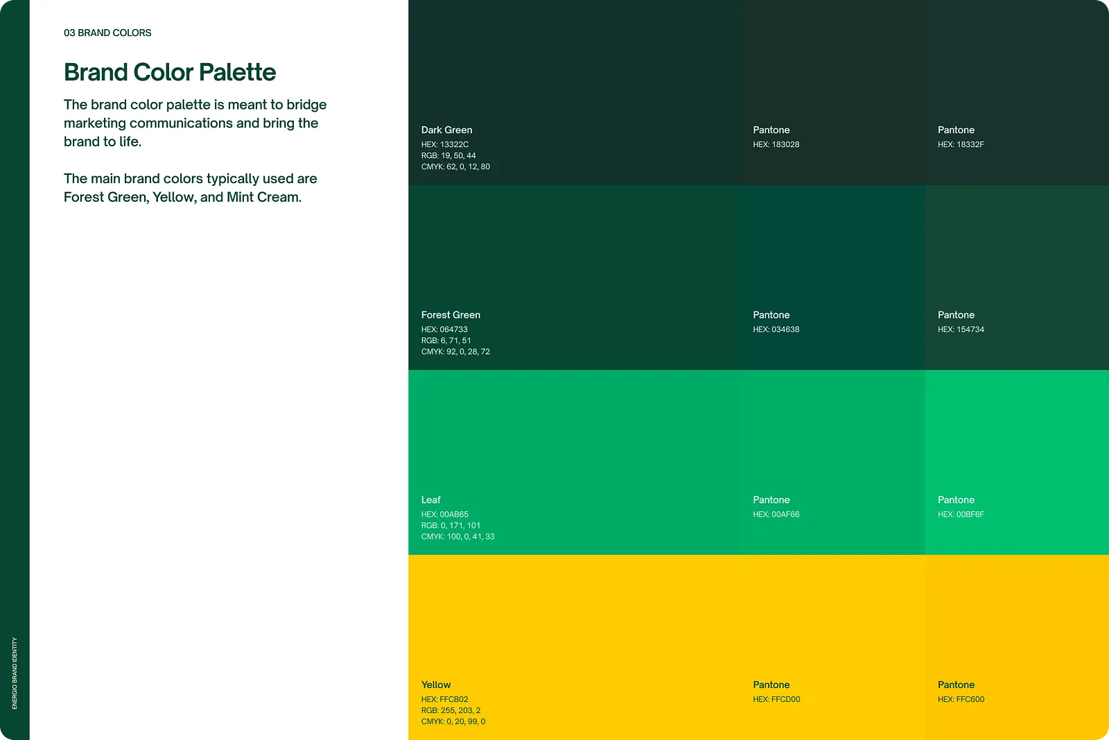
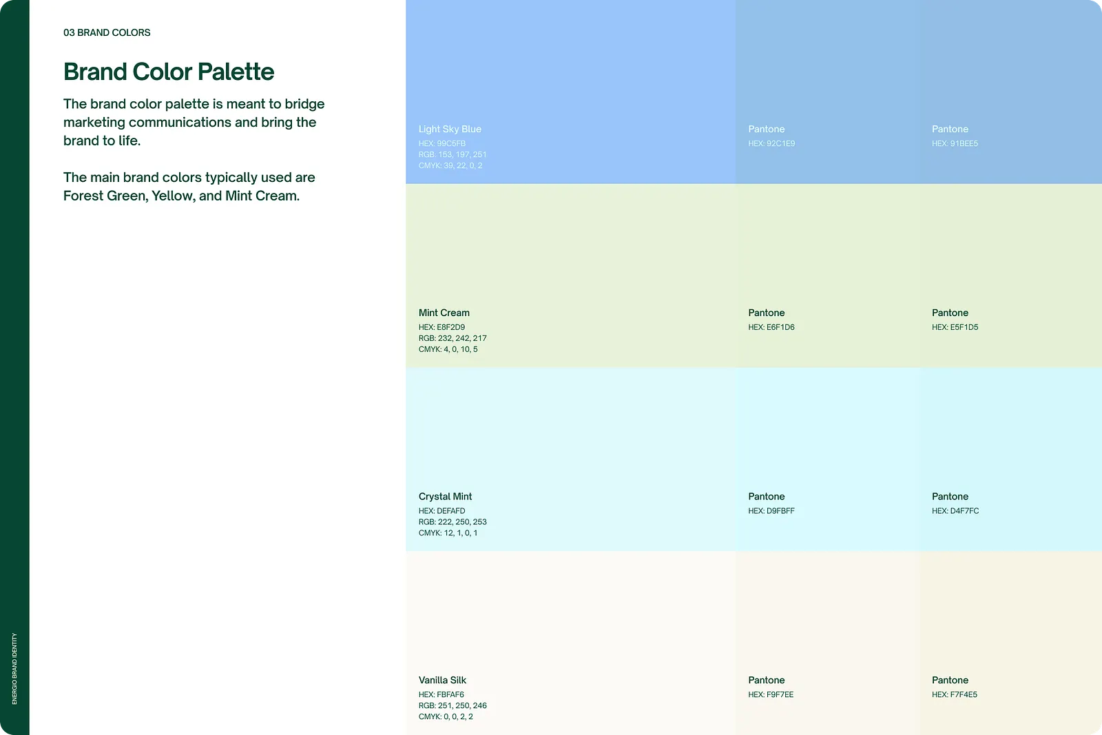
A color palette full of energy.
We built a palette that feels alive, vibrant enough to stand out in the market, but grounded enough to build trust. The colors communicate momentum and clarity, which is exactly the feeling Energio needs to project. When a homeowner lands on their website or receives their business card, the energy should feel immediate. This is a brand that moves.
The color story is one of the things Yi Shien was most excited about. She wanted Energio to feel modern and energetic and the palette delivered exactly that.
Typography
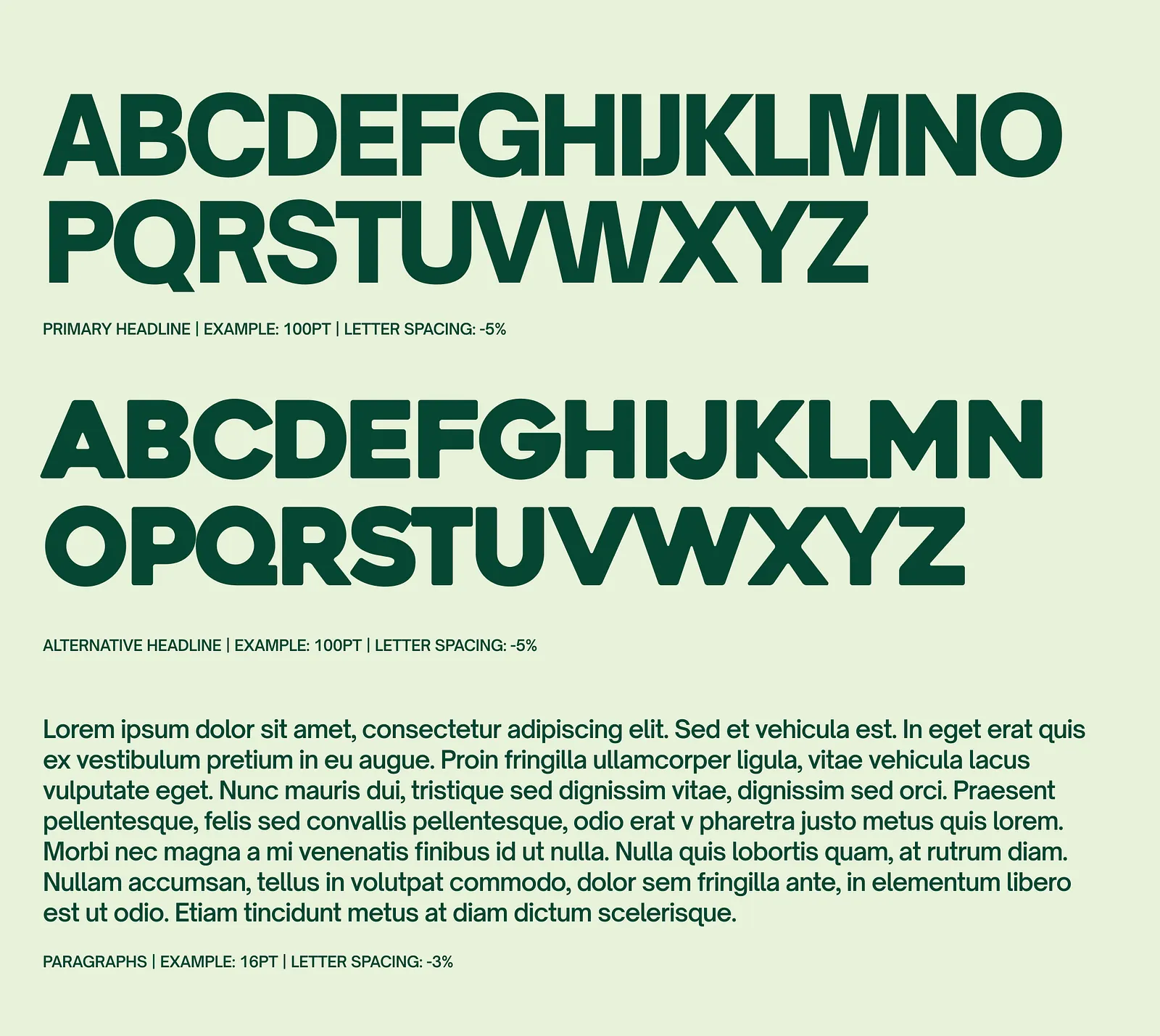
Heavitas was too heavy. Open Sauce One was just right.
Typography is one of those things most clients don’t notice — until it’s wrong. For a brand like Energio that deals in a lot of content (FAQs, educational material, service breakdowns), getting the type right isn’t optional. It’s essential.
We landed on Open Sauce One as the primary typeface. It’s clean and modern, but it has warmth which matches Energio’s personality perfectly. It doesn’t scream corporate. It doesn’t whisper either. It’s confident, clear, and easy to read at any size.
Typography that educates without intimidating. That’s the brief.
A brand that’s mostly about showing results, we need to get the visuals right
Choosing the right partner to install solar panels is a big decision. And unlike most purchases, the website can’t just be a pretty brochure. It has to do the heavy lifting of educating a customer who is still figuring out whether solar is even right for them.
So we designed the website around two things: proof and education.
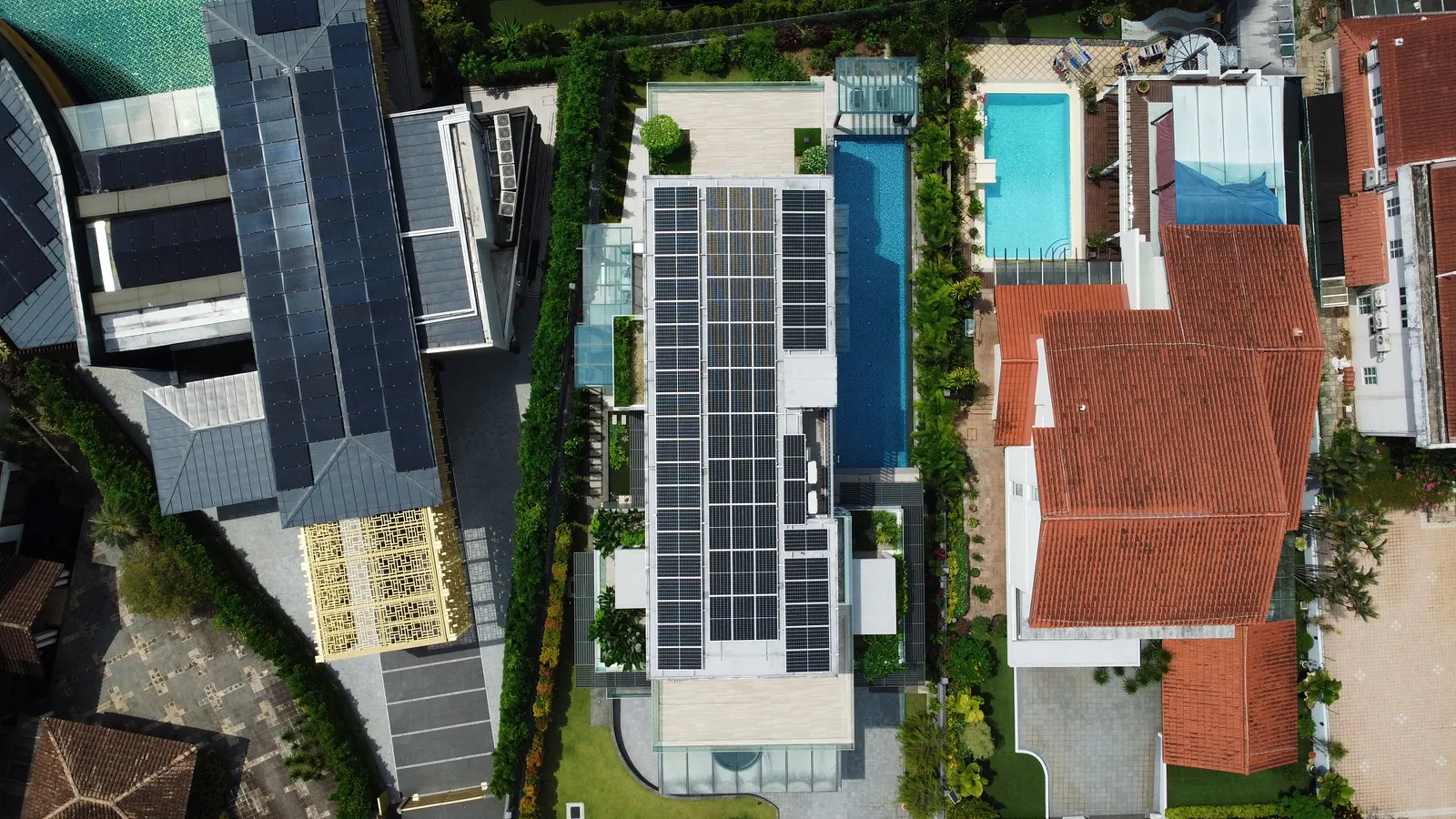
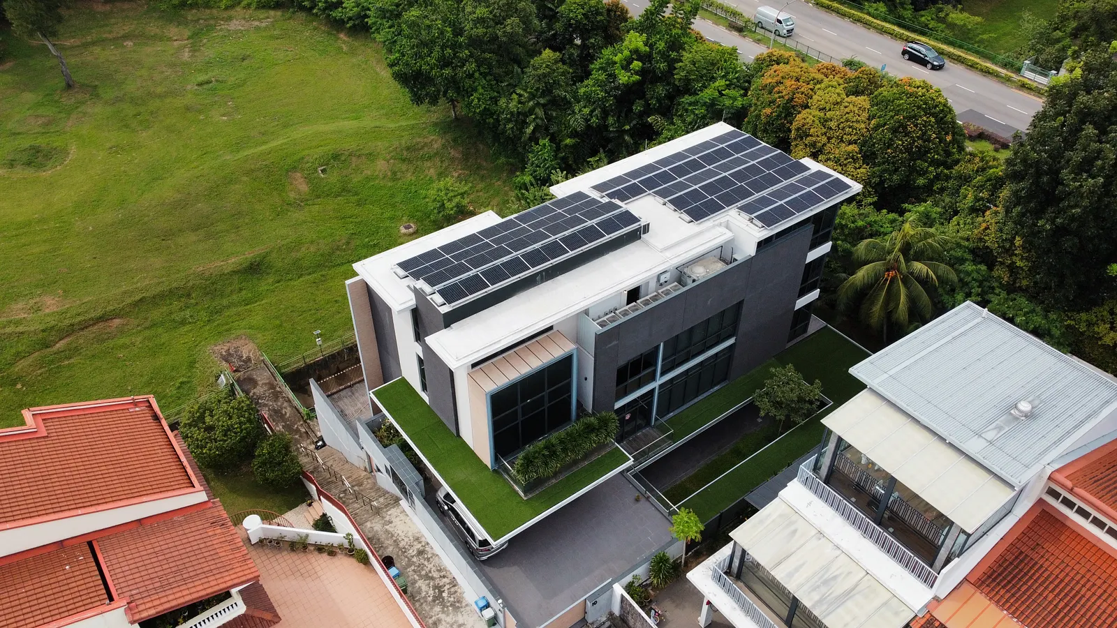
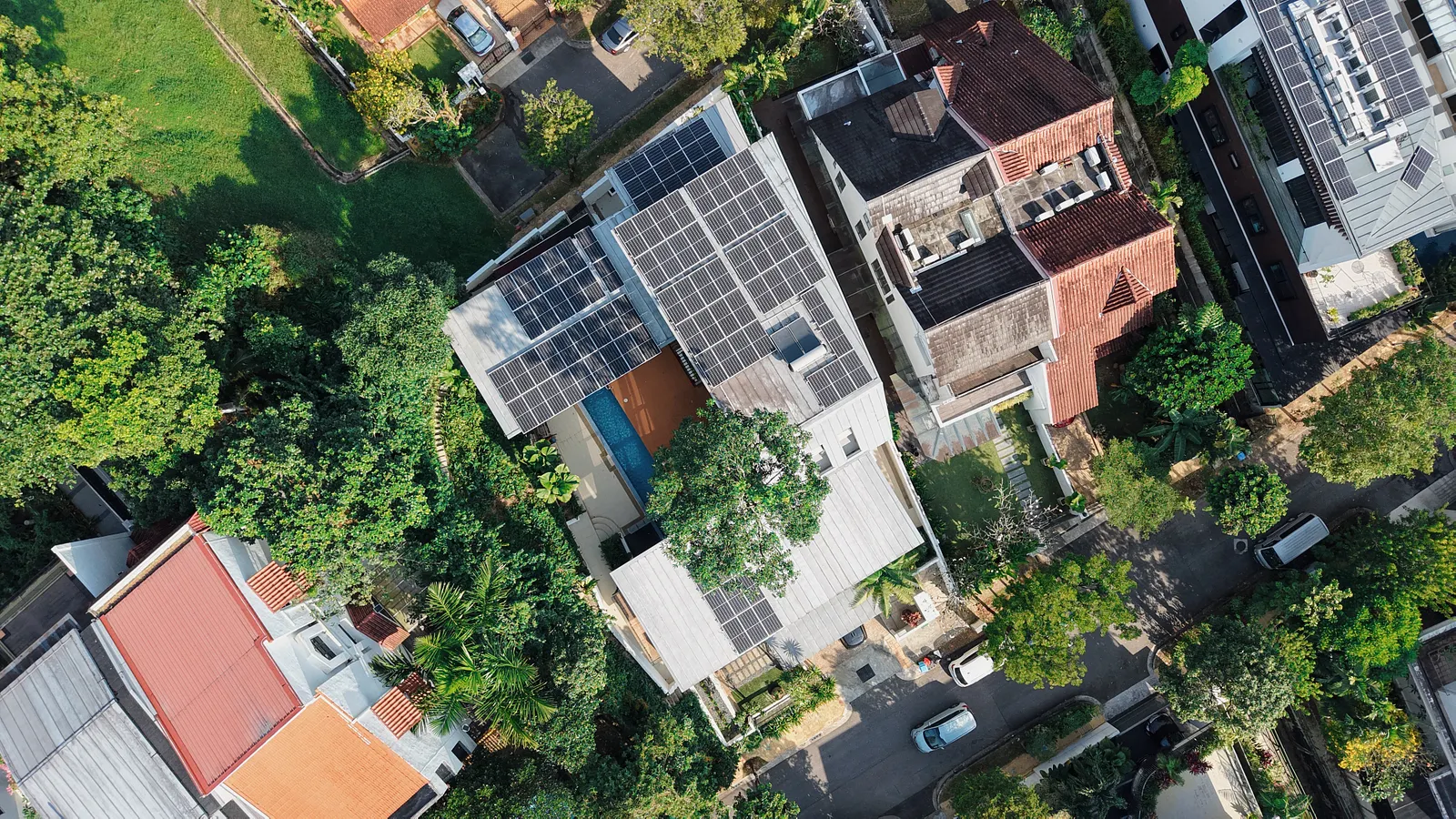
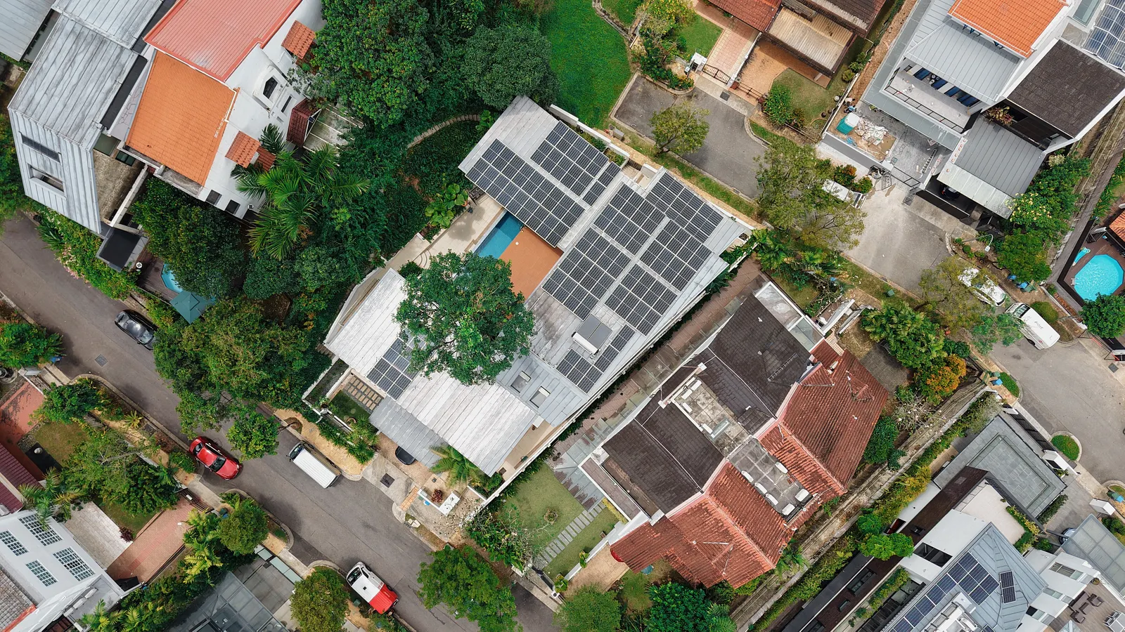
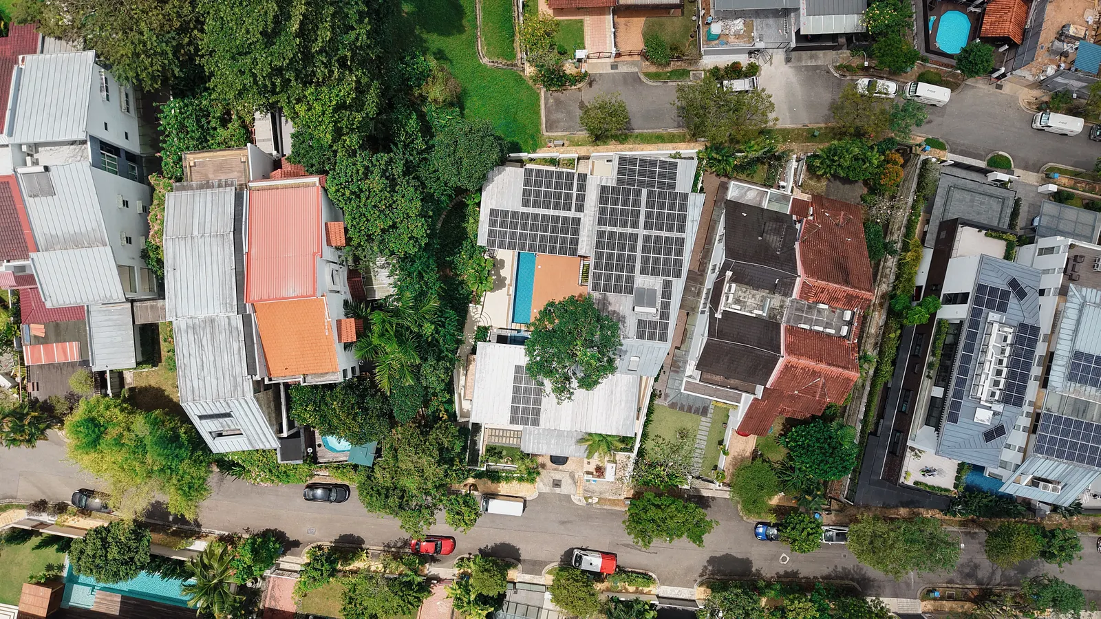
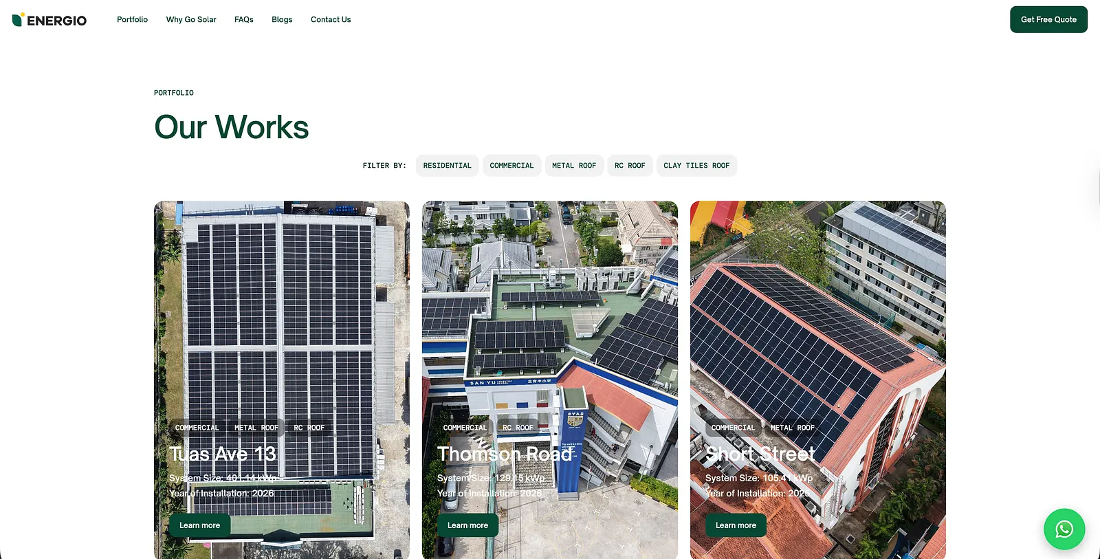
An extensive portfolio: past projects that homeowners can actually relate to, with drone shots of completed residential installations. Seeing is believing.
Clear, simple explanations: what happens if you engage Energio, step by step, without the jargon. (Yeah, we don’t want to bore them out either)

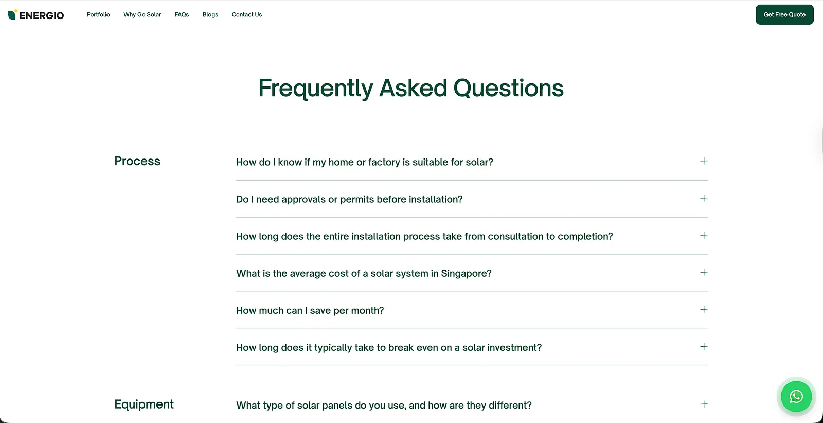
A good FAQ page: one that genuinely answers the questions people are too embarrassed or too confused to ask. This is where knowledge accessibility lives on the website.
A team that shows personality: because Yi Shien didn’t want to be another boring solar company, and frankly, neither did we.
The goal was to make the entire journey from “I’m curious about solar” to “I’m ready to get a quote” feel guided and effortless. Education leads. Trust follows. Conversion happens. Oof, feels so smart coming up with this.
Brand Collateral

We extended the brand across all the key touchpoints — the ones that show up in real life and make the brand feel real.
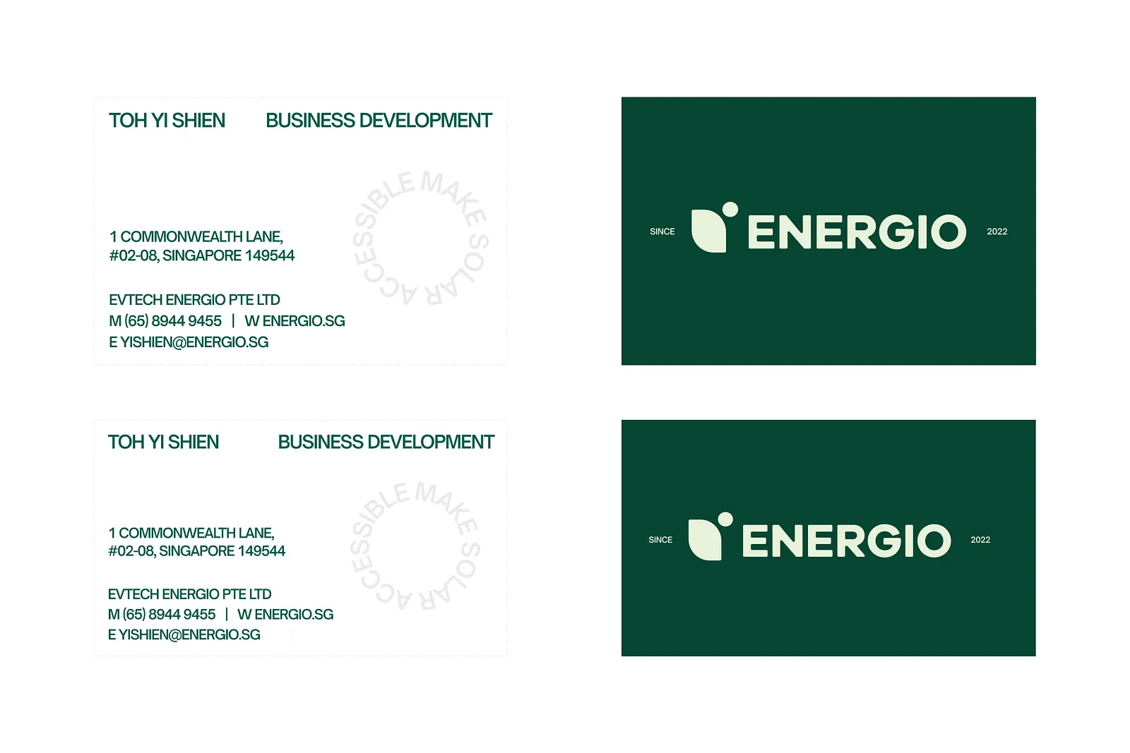
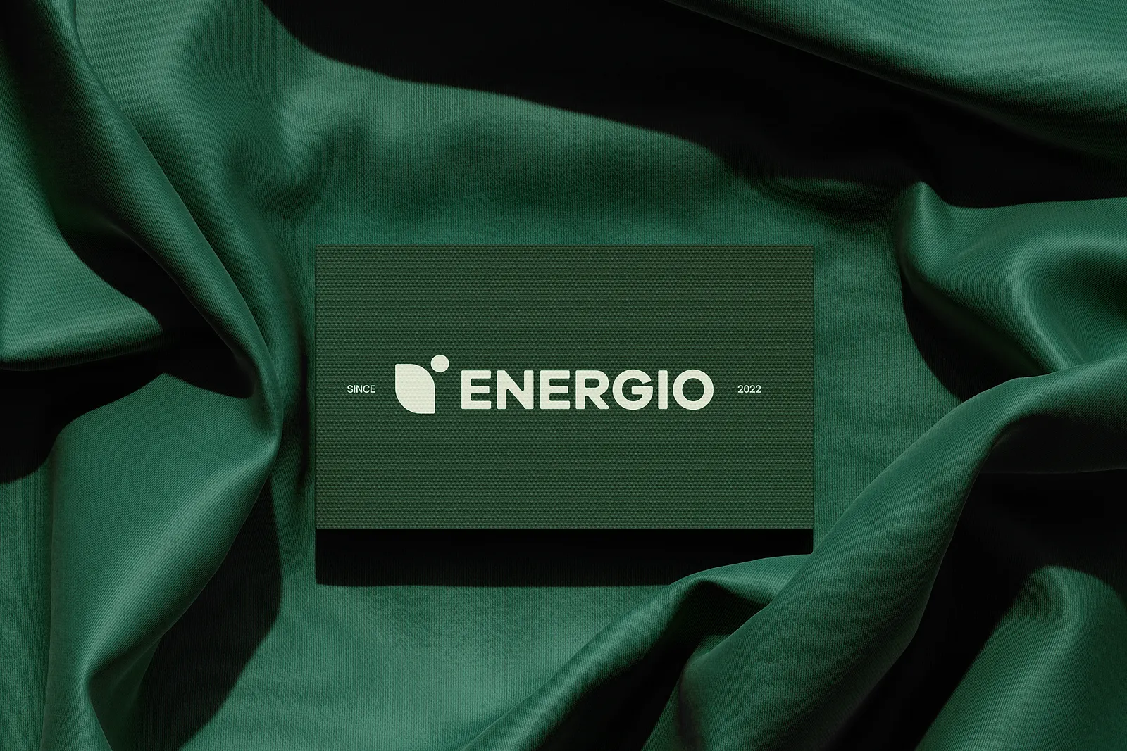
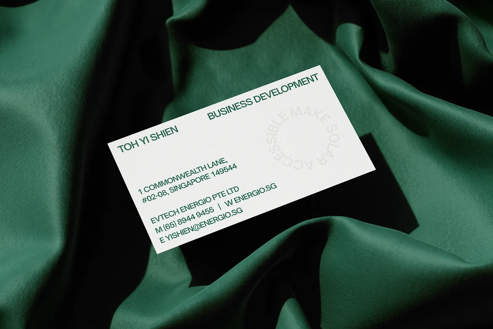
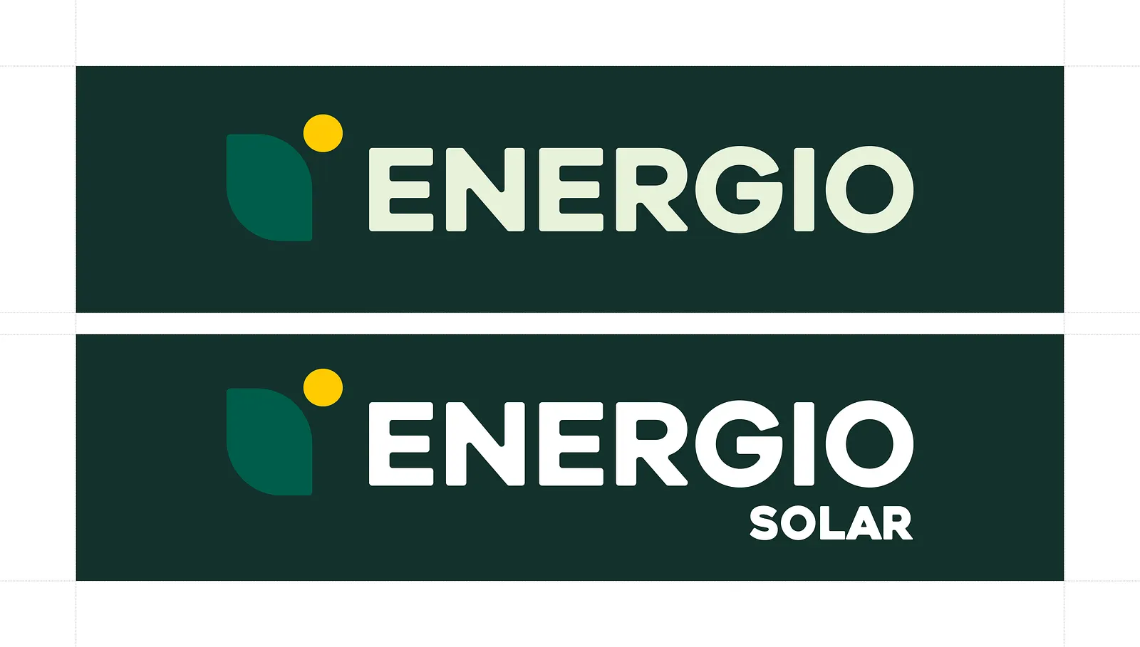
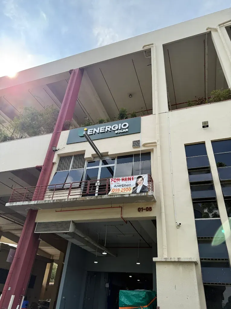
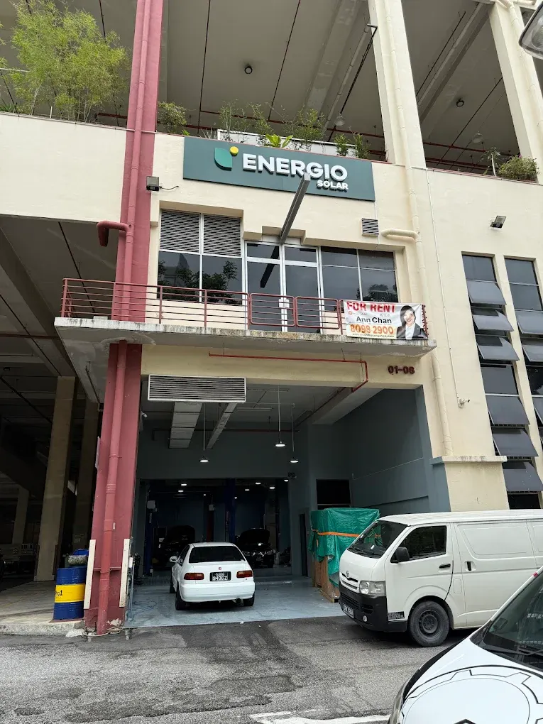
Seeing what we’ve designed being placed up high to represent the brand truly was a boasting point.
“Make Solar Accessible” is officially live
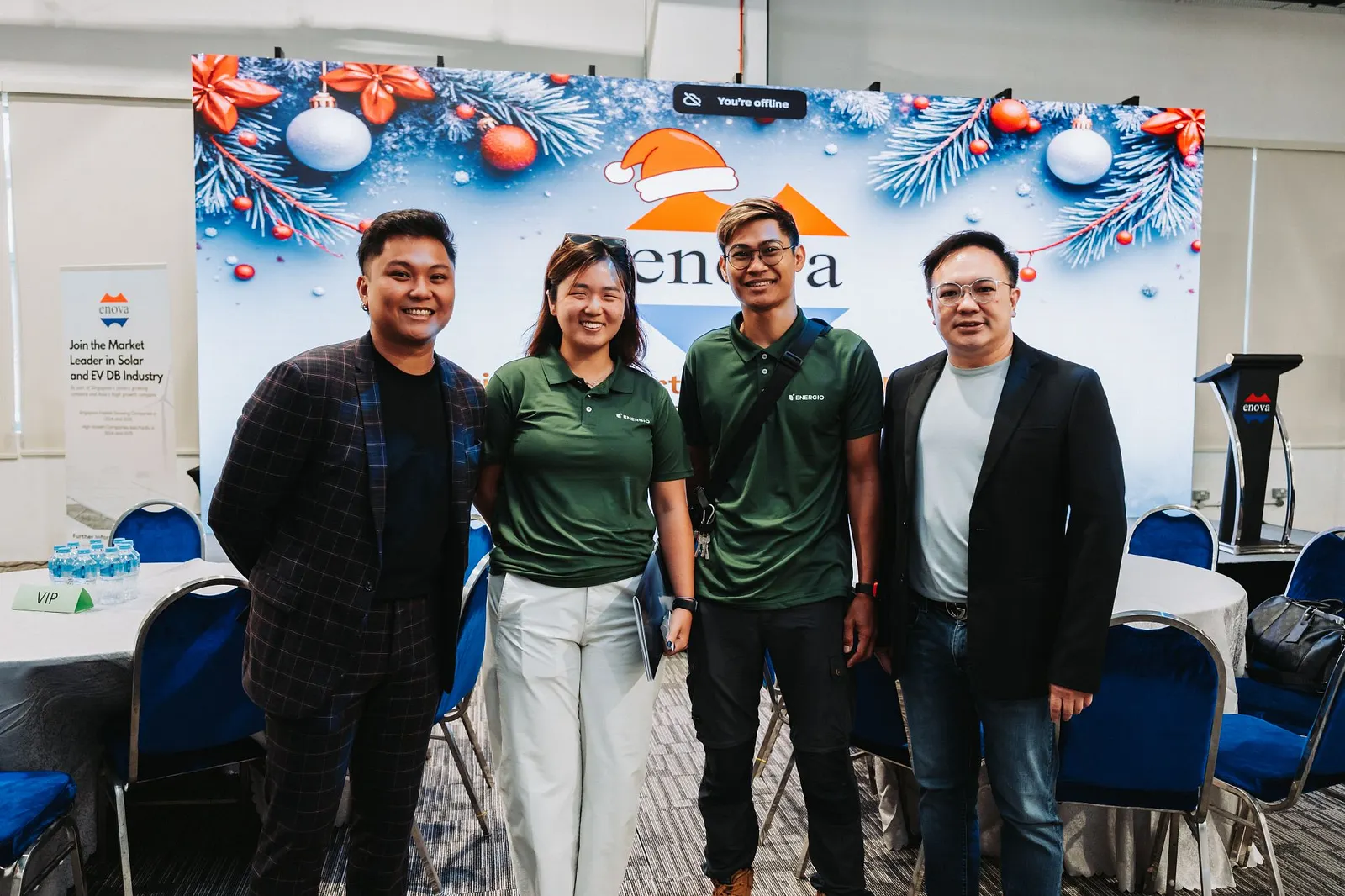
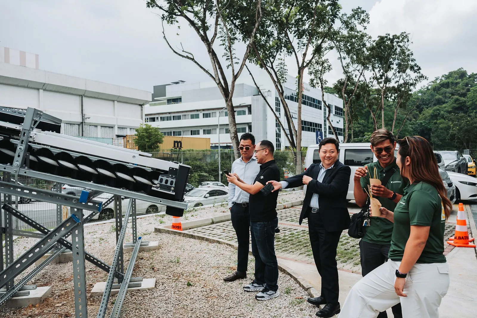
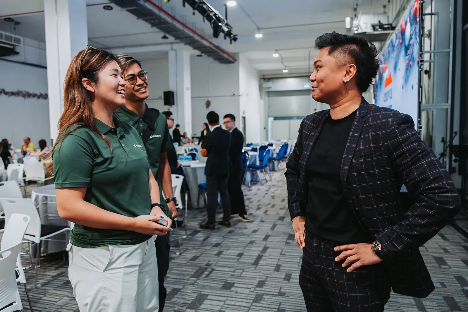
Not long after we launched the newly refreshed brand, Team Energio showed up representing the new brand in full at Enova Electrical Pte Ltd’s Annual Christmas Party.
This is always our favorite moment. When the client isn’t just looking at mockups anymore and proudly living the brand. For Yi Shien, this was more than a rebrand. It was the beginning of a brand that finally matched the mission she’s been building toward since her father built that first system at home.
For years to come.
Energio now shows up with a clear voice and a clear promise, ANDDD doesn’t just sell solar installations. It makes the confusing feel simple. The intimidating feel approachable. The future feels within reach.
And that, to us, is what good branding does.
Make Solar Accessible. We’re proud to have helped make that possible.
“Designlabb was a huge help in rebranding our website. They were very communicative throughout the process and took the initiative to thoughtfully incorporate my feedback into the design. The turnaround time was impressively fast — I highly recommend working with them!”Yi Shien, Energio