
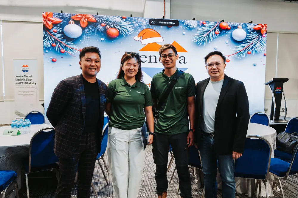
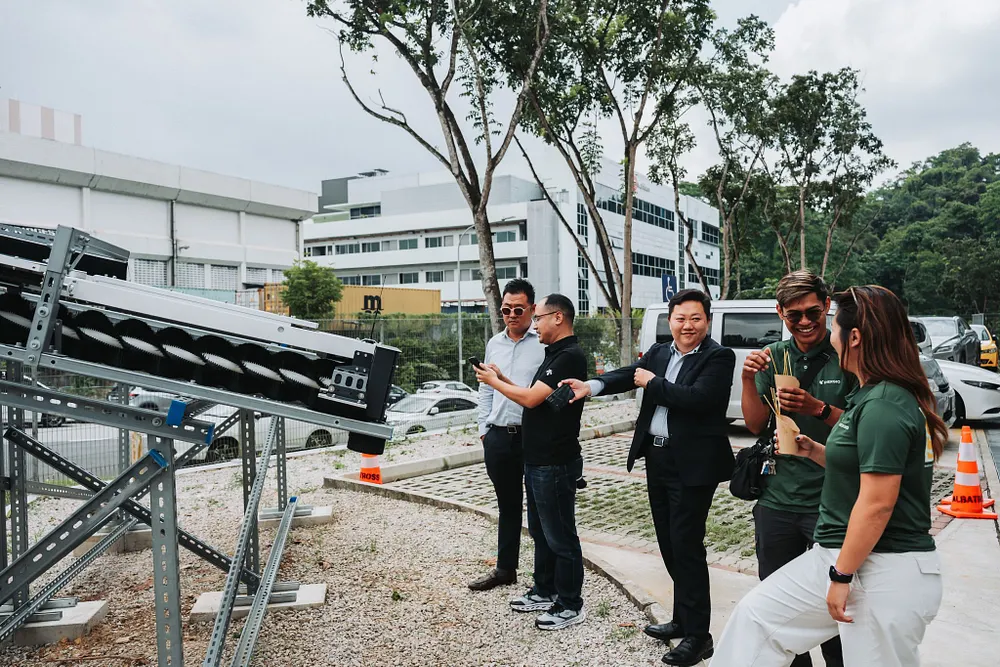
Energio is a Singapore-based provider of solar PV integration and EV charging solutions for both homeowners and corporates. Founded from a personal journey navigating the complexities of solar installation, Energio combines the perspective of a homeowner and a service provider, understanding the real doubts, questions, and decisions people face when going solar.
The company’s mission is to make clean, renewable energy accessible, understandable, and practical, helping clients reduce their carbon footprint while saving on electricity costs. Energio stands apart not just through technical capability, but through sincerity, guidance, and education, making the solar journey clearer from the very first conversation.
Energio had a meaningful purpose but a brand identity and website that did not yet communicate it. Solar is often presented with jargon, technical specifications, and conflicting claims that leave homeowners overwhelmed and afraid of making the wrong decision. The real barrier was not technology, but uncertainty. Energio exists precisely to bridge this gap, giving people the knowledge and confidence to move forward.
Our task was to build a brand that felt bold yet sincere, expert but approachable, and capable of speaking clearly to both homeowners and corporates. From this strategic exploration, the core brand idea emerged: “Make Solar Accessible.” This line became the foundation for everything — identity, messaging, website structure, and visual direction.
.gif)
.gif)
.webp)
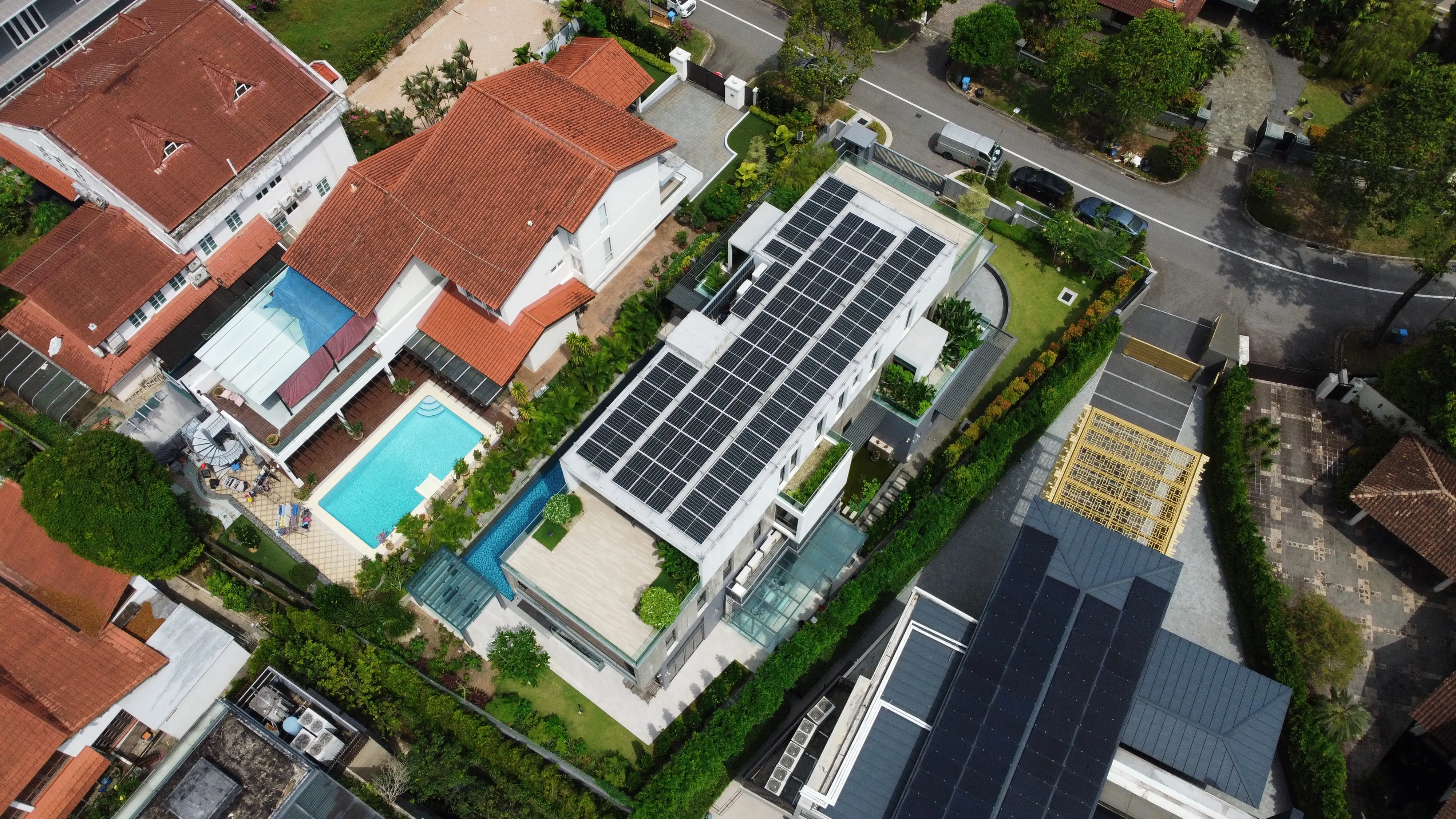
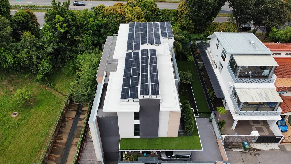
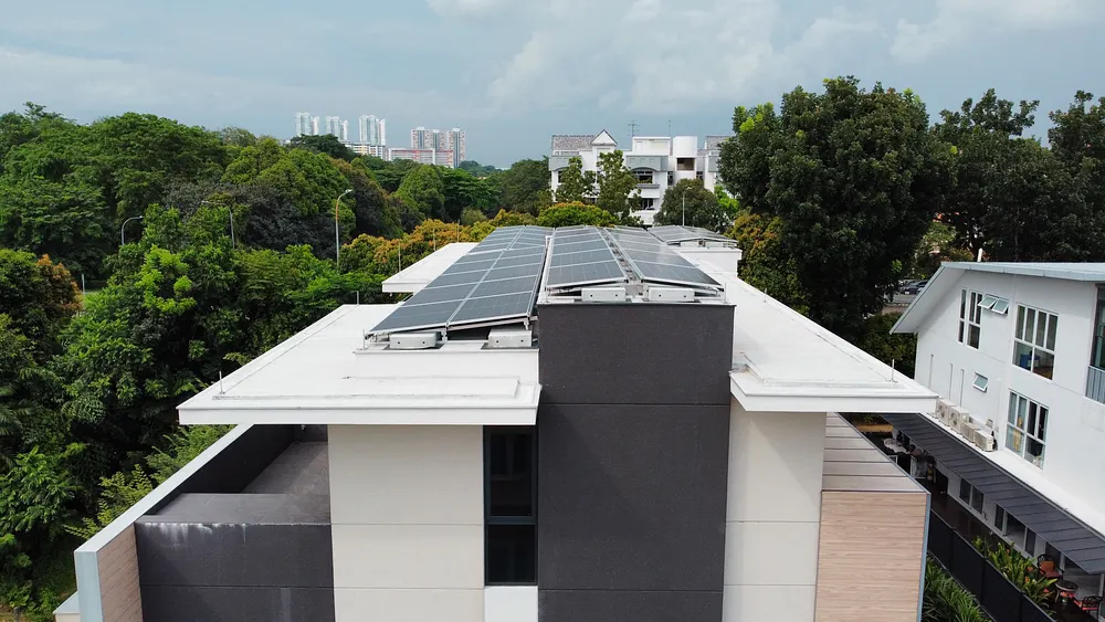
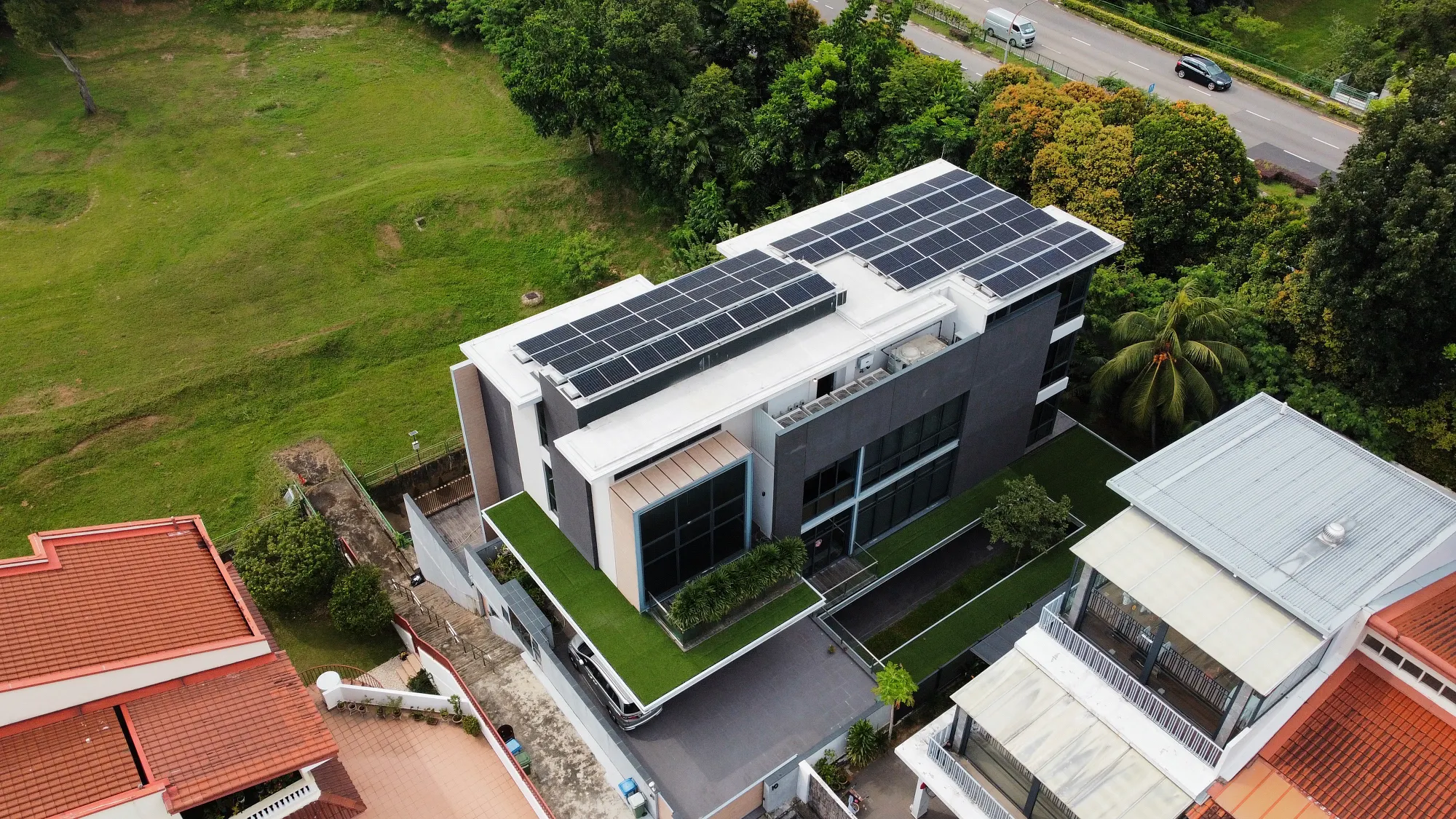
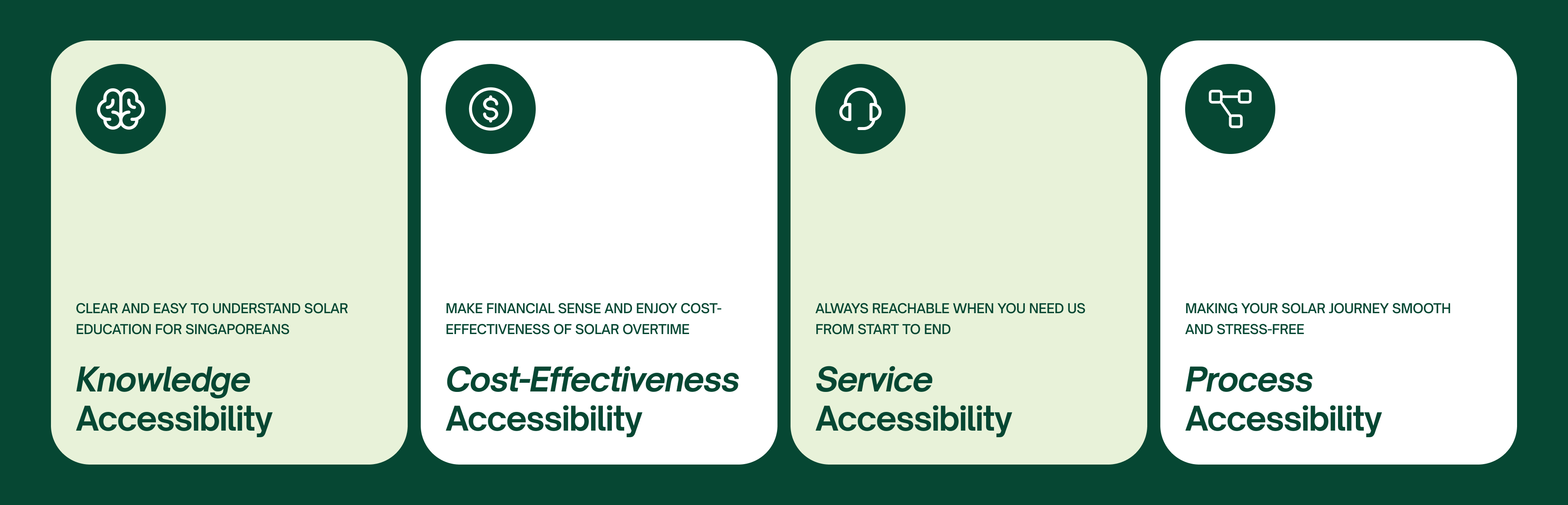
To stand out, we need to keep it simple, accessible, and empowering. Hence, we positioned Energio as a solar partner for Singapore homeowners who want to invest in solar but feel lost in the complexity and unreliable information. Energio makes everything accessible with guidance, transparent expertise, and support that evolves with customers throughout their entire solar journey. For Energio, there are four core accessibilities to solar: Knowledge accessibility, cost-effectiveness accessibility, service accessibility, and process accessibility.
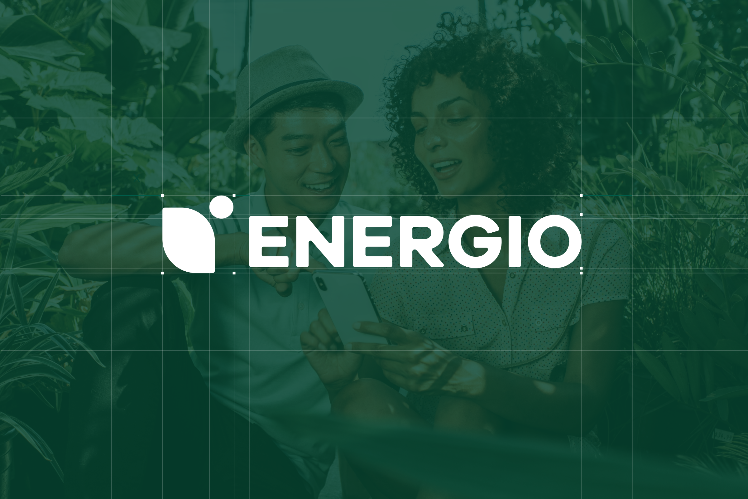
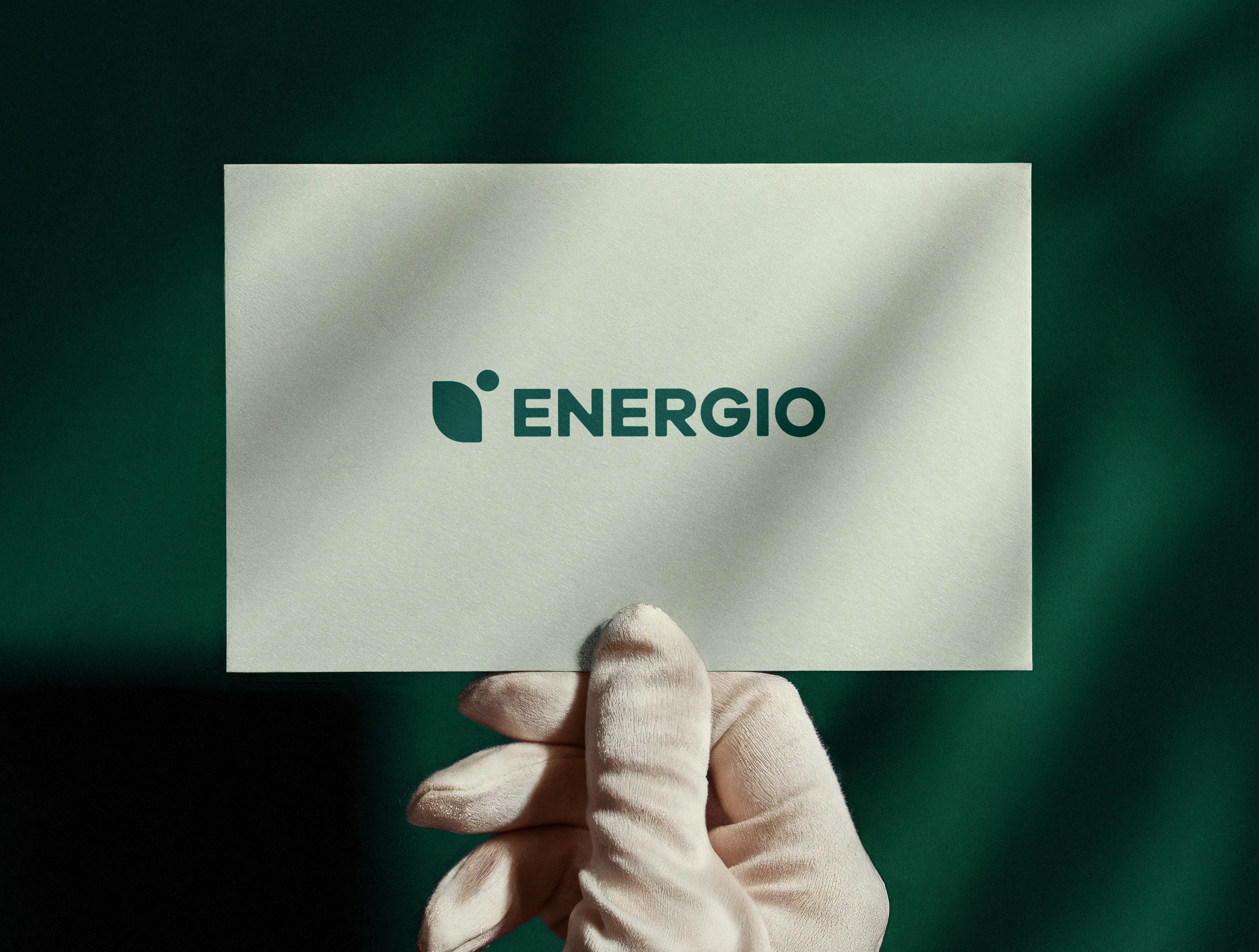
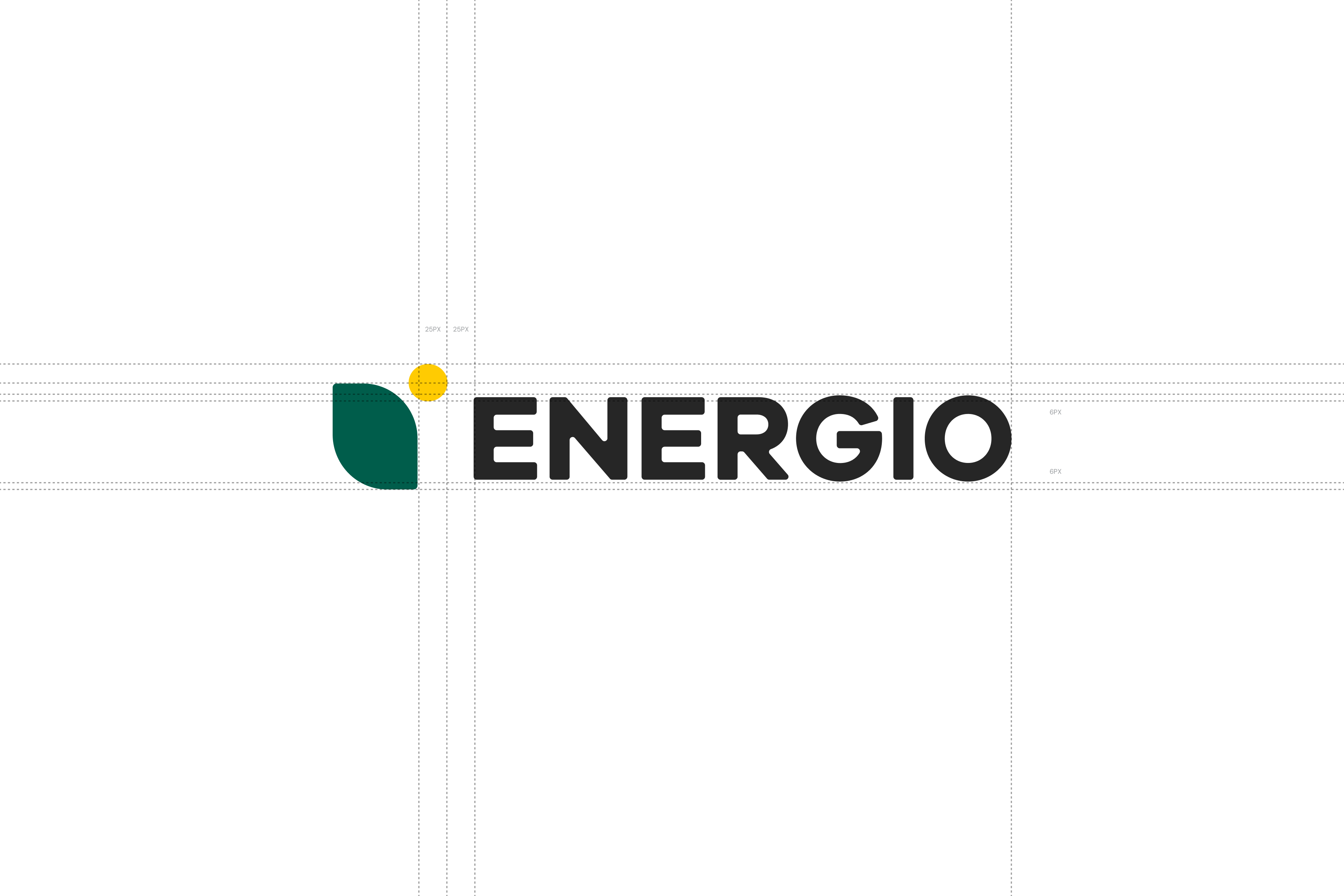
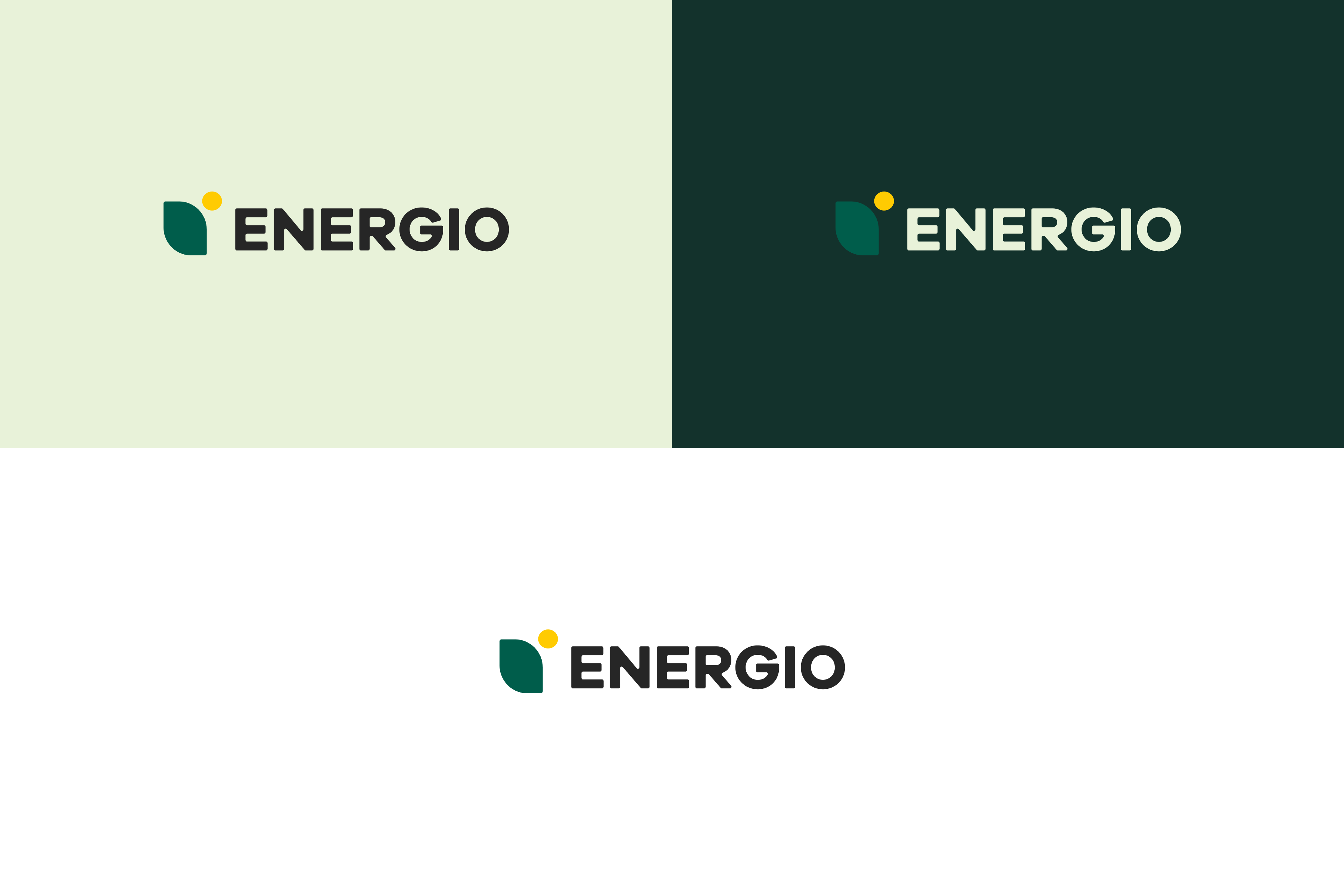
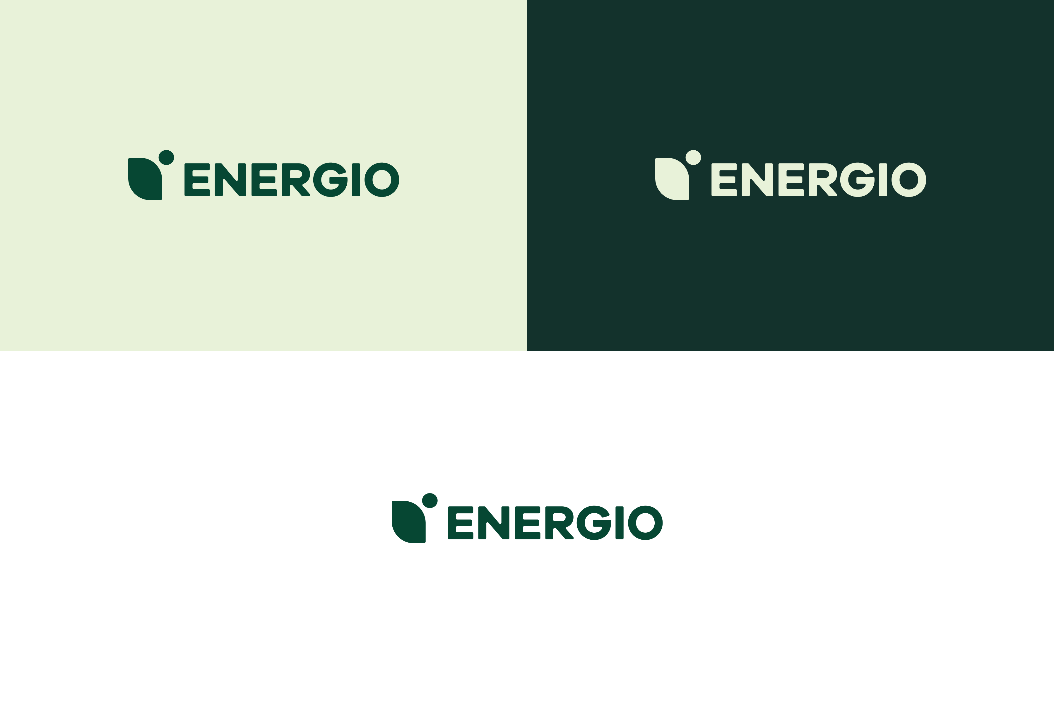
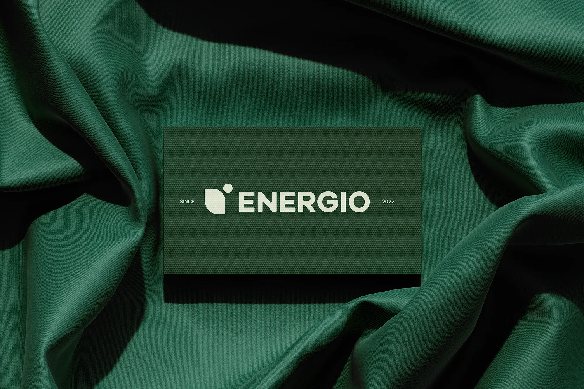
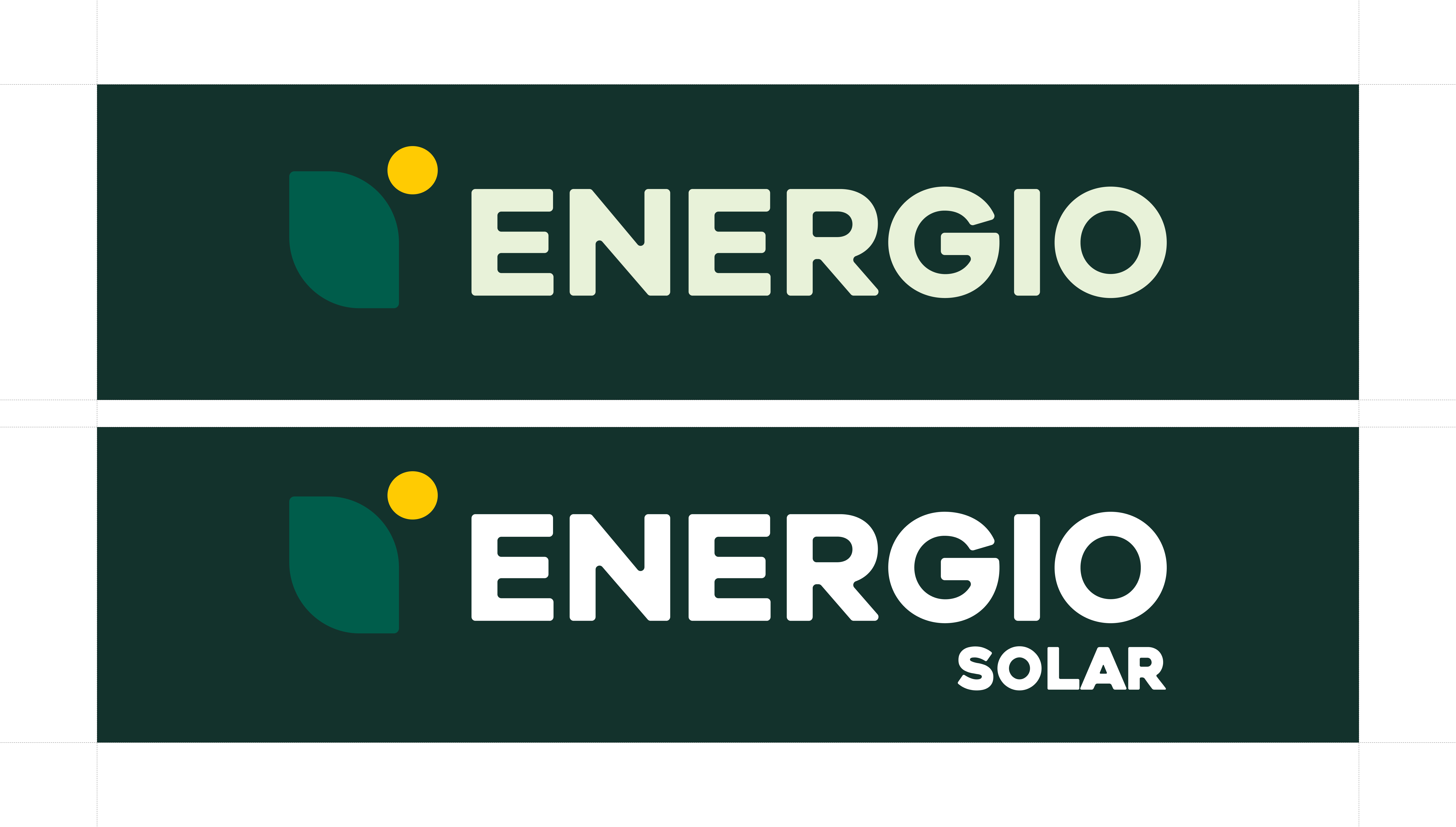
In terms of visuals, we used the same logo they previously had, combining a leaf and sun motif to symbolise sustainability and solar energy, supported by a geometric wordmark that balances strength with approachability. However, what we changed was the colours used.
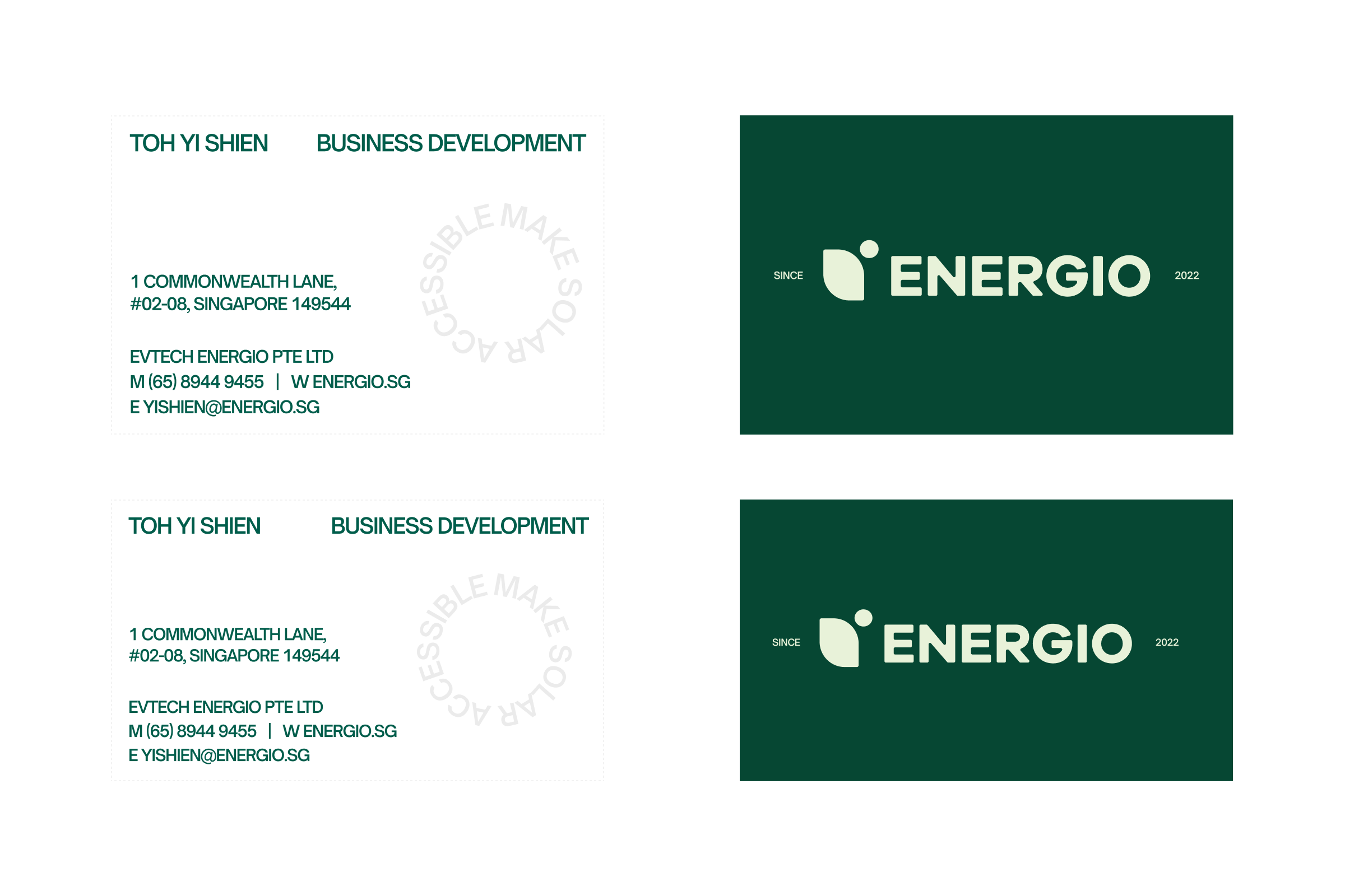
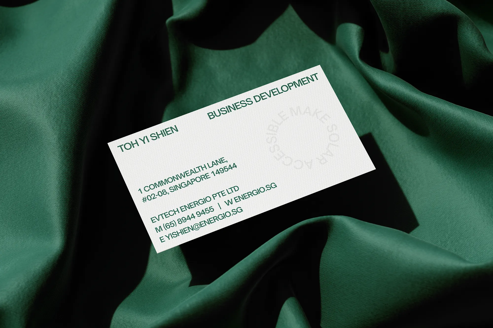
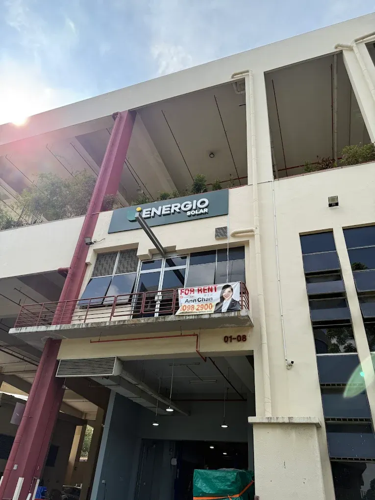
A vibrant energy-inspired colour palette and modern typography reinforced trust, clarity, and momentum. These elements were extended across key touchpoints, including the website, portfolio showcases, FAQs, business cards, and environmental signage. The website was designed to answer real questions, show real results, and make the journey to solar adoption feel simple and guided rather than intimidating. The result is a unified brand that does more than sell solar installations. Energio now shows up with a clear voice and a clear promise: to make solar accessible for homeowners and corporates, today and in the years ahead.
"Alvis from Designlabb was a huge help in rebranding our website. He was very communicative throughout the process and took the initiative to thoughtfully incorporate my feedback into the design. The turnaround time was impressively fast - I highly recommend working with him!"